Search for:
espresso coffee
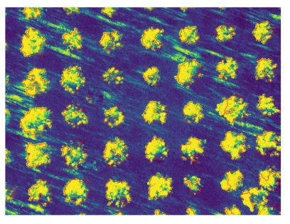
Coffee leaf miner infection located by multispectral imaging
espresso coffee
espresso coffee

There’s an awful lot of coffee in Brazil! according to the old song recorded by Frank Sinatra. In 2021 almost 70 million 60kg bags of coffee were produced in Brazil, roughly one third of global production, making Brazil the largest coffee producer in the world. Yield varies from year to year depending mainly on the weather but also on disease risks.

Coffee leaf miner infection is a major cause of poor cropping and ultimately plant death. These little critters are the larvae of a tiny moth that lays its eggs on the surface of coffee plant leaves. They munch their way into leaves leaving black holes filled with (ahem) poop, which create the impression of tiny mine shafts in the leaf.

Researchers at the Federal University of Lavras in Brazil have demonstrated a new way to spot the effects of disease in coffee plants using a drone equipped with a multispectral imaging camera.
coffee plant
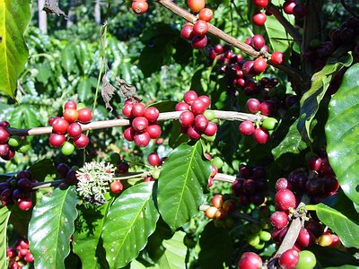
Healthy coffee plant (courtesy WikiMedia Commons)

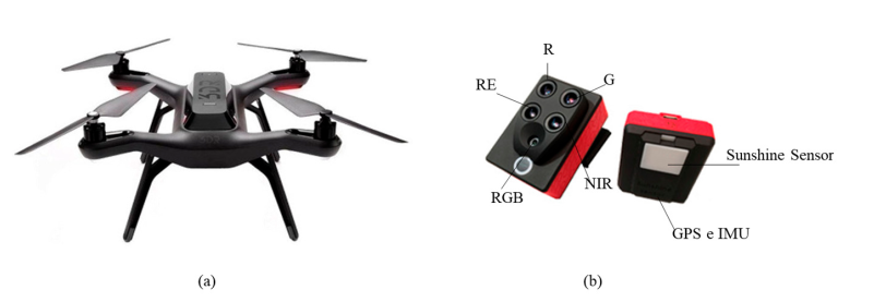
They flew the drone over a coffee plantation in the Minas Gerais region of Brazil. At a height of 3m it was possible to record images of individual coffee leaves on different Coffea arabica L. plants, images being taken with a multispectral camera. Four wavebands were used for the imaging: 530-570 nm  (green); 640-680 nm (red); 730-740 nm (red edge); and 770-810 nm (near infrared). Similar images were recorded manually of the leaves of healthy coffee plants of the same species in a greenhouse for comparison.
drone and multispectral camera
(a) Quadcopter drone and (b) multispectral camera used in plantation (courtesy AgriEngineering Journal and University of Lavras)

Images from any single camera waveband are subject to variations in sunlight and shadowing therefore researchers have developed a large number of different so-called Vegetation Indexes (VIs) to allow comparison of measurements on different days and at different locations. The normal method is to use a ratio of a camera waveband that changes a lot against a waveband that does not typically change very much. Possibly the most popular vegetation index is NDVI, Normalised Difference Vegetation Index:

NDVI = (NearInfrared – Red) / (NearInfrared + Red)

Plants absorb red and blue light strongly, reflecting green and near infrared therefore they have relatively high NDVI values (0.8-1.0). Basically the higher the NDVI value for a plant leaf, the greener and healthier it is. 

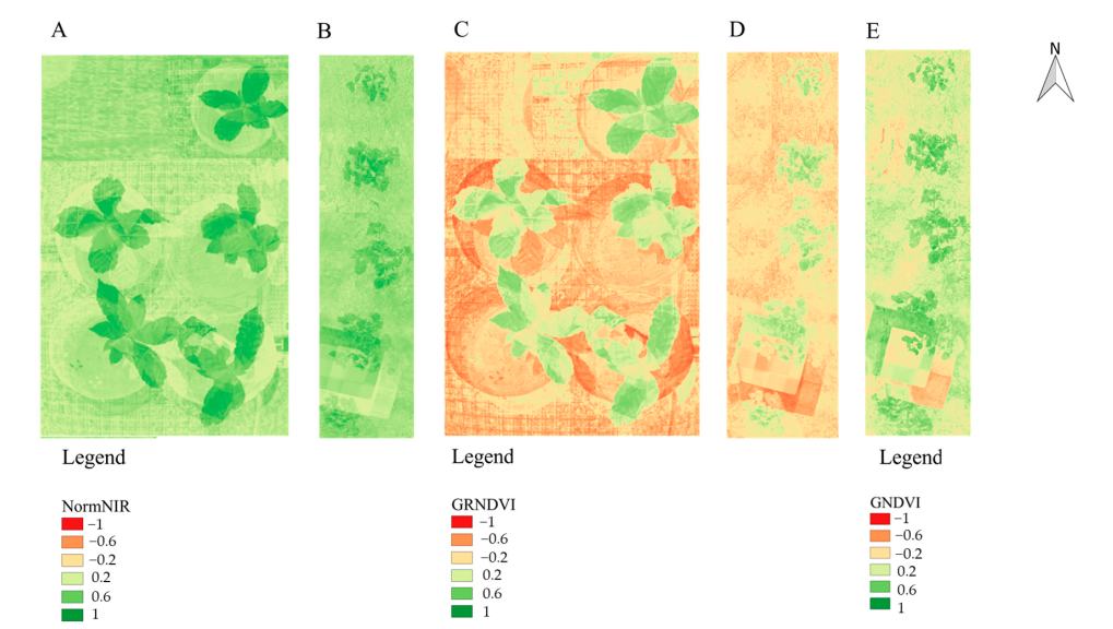
The team at Lavras wanted to discover which VI was the most effective at distinguishing healthy coffee leaves from leaves infected by coffee leaf miner. They reasoned that because infected leaves are generally darker due to the poop tracks, healthy  leaves should typically have higher VI values.
coffee plant vegetation index images
Coffee plant vegetation index images: (A, C) Healthy in greenhouse; (B, D, E) infected in plantation (courtesy AgriEngineering Journal and University of Lavras)

Comparison of the average difference in VI values and their distribution across many leaves showed that the GRNDVI index gave the best differentiation between healthy and diseased coffee leaves. Accounting for Green and Red variations between healthy and diseased leaves gave ratios of 0.32 and 0.06 for healthy and leaf miner infected leaves respectively. These values are lower than the NDVI values measured but give a much larger difference, allowing better differentiation.

Coffee farmers could benefit from quicker identification and location of leaf miner disease in their plantations if this research can be transferred to a commercial product. Coffee drinkers the world over could benefit from more sustainable farming and more stable pricing for their favourite brew.
Read the full journal paper here.

Find out about Vegetation Indexes here.

Find out more about coffee production in Brazil here.

Italian vineyards investigated with Google Earth
italian vineyards map
Locations of vineyards in Italy (courtesy Elsevier and University of Padova)

At the end of the old year journalists like to write articles summarising events, listing items, totalling numbers. At the beginning of the New Year writers and readers alike become more philosophical, resolving to extract information from mere data and wisdom from observations. Google Earth has been a phenomenal source of data for many years but now a group from the University of Padova have just reported how to use Google map data to quantify how and where Italian farmers are tending their vineyards.

With a few Open Source software tools, Alessia Cogato and her colleagues gained real insight into viticulture throughout Italy from satellite image data from Google Earth. The potential wisdom from the study is to establish: how many Italian vineyards could be mechanised to improve efficiency; where they are located; and what type of mechanisation should be employed.

According to an old English book on horticulture, pruning vines is rated difficult compared to other crops. There are various methods of cultivation, training vines either vertically (Free-cordon and Geneva Double Curtain) or horizontally (Pergola and Tendone). Vertical cultivations are typically much easier to mechanise therefore local viticulture tradition is an important parameter in improving efficiency.

Other effective parameters (which can be different from one vineyard and region to another) are: the spacings between rows; the amount of spare land at the end of a row to turn a tractor; and the slope of the vineyard. The Padova group devised a Level of Mechanisability index which takes account of all the parameters to assess the viability of improving the efficiency of vineyards by mechanisation.

So how did they glean the required information from Google Earth data?

QGIS Open Source software screenshot

Geography today is a sophisticated science, far from ‘advanced colouring in’ as some snooty physical science students used to refer to it. Displaying geographical data, mining the data and analysing the data is the work of a Geographic Information System (GIS). The team used QGIS to analyse image data from Google Earth. QGIS is an Open Source project available for Windows, Linux and Mac OS platforms. QGIS allows multiple layers of earth data from different sources to be displayed, correlated and analysed.

Italian vineyard parameterisation (shape headspace LxW ratio row spacing) and cultivation (inset) (courtesy Elsevier and University of Padova)

QGIS was also used to import and analyse terrain slope data from the Institute for Environmental Protection and Research of Italy (ISPRA).

Slope data for terrain in Italy derived from satellite images (courtesy Elsevier and University of Padova)

Combining all of the key parameters from the raw image data, Levels of Mechanisability were calculated for each of the 3686 vineyards in the Padova study.

With vineyards in southern Europe under pressure from climate change and a global pandemic, sustainable cultivation methods are more important than ever. Looking forward into the New Year, the Padova team will hope government agencies apply some wisdom derived from their information based on Google satellite data.

The data report published by Elsevier can be found here. A full report of the study can be found in the Journal Land.

Images from Elsevier and University of Padova used courtesy of the Creative Commons licence.

[ratemypost]

Identification of Xylella fastidiosa disease in olive trees by multispectral imaging
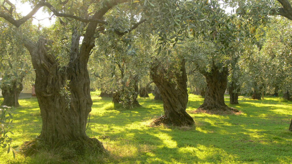
Olive trees (courtesy Creative Commons)

Humans are not the only species susceptible to bugs from foreign shores. Olive trees in Italy are falling prey to a nasty bacterium, Xylella fastidiosa, that has hitched a ride on unwanted migrants. In this case the migrants were insects on plants originating from the Americas. X. fastidiosa causes Olive Quick Decline Syndrome (OQDS) and affects not only olive trees but also grape vines and citrus trees.

The problem requires urgent action, with 100,000’s of trees in southern Italy affected and the disease spreading elsewhere in southern Europe. There is no cure. Early detection and attack against the insect vectors is the best course of action. Unfortunately the quick decline of infected trees means that action can be too late to save the trees or contain the spread of the disease. According to the European Commission it is one of the most dangerous plant diseases in the world today.

As in the struggle against COVID-19, scientists have invented sensitive PCR (Polymerase Chain Reaction) tests for the disease but they are rather slow and require adequate sampling. There are also much quicker biochemical (ELISA – Enzyme Linked Immuno-Sorption Assay) tests but these are not as robust. What to do?

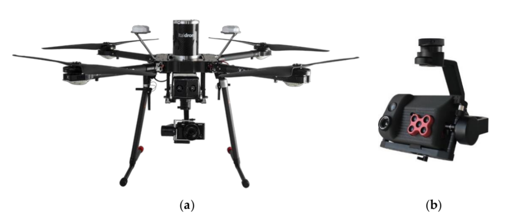
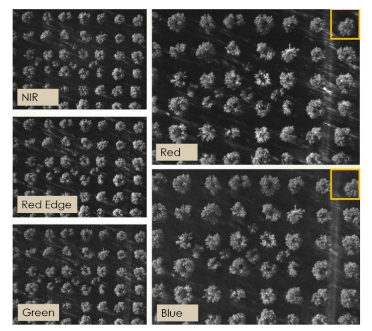
A team at the Polytechnic University of Bari in Italy have developed a rapid non-invasive method using multispectral imaging with cameras carried aloft by drones. UAVs (Unmanned Autonomous Vehicles) are used to gather not just images of olive trees in conventional colour but in five chosen channels within the visible/near-infrared spectrum.

University of Bari drone (a) and camera payload (b) (image courtesy MDPI)

Writing recently in the journal Sensors, the Bari team carefully describe how drones were flown over healthy and diseased olive groves and the image data analysed. Conventional images of trees in the largely diseased grove (Squinzano) and healthy grove (San Vito dei Normanii) looked very similar. Multispectral images from San Vito dei Normanii are shown below.

Five spectral channel images of olive trees (image courtesy MDPI)

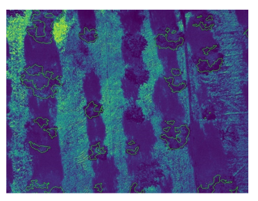
It is only when the angles, scales, sunlight illumination are all corrected for that the raw data can be analysed. Using a clever mathematical method know as linear determinant analysis (LDA), the Bari team were able to classify individual trees as healthy or diseased. They then used that classification to calculate a probability that each pixel in separate olive grove images was from a diseased tree.

Uninfected olive tree grove probability map (image courtesy MDPI)
Infected olive tree grove probability map (image courtesy MDPI)

It is immediately obvious from the heatmap probability images of the two olive groves above, which one is infected. The hot yellow colours of the lower image from Squinzano contrast strikingly with the cold dark tree areas of the image from San Vito dei Normanii. The Bari team calculated a 98% sensitivity and 100% precision for the multispectral imaging determination of diseased trees.

Although impressive, this Xylella Fastidiosa discrimination method still requires further development work to be useful in the fight against its spread in Europe. The methods used seem transferable to other olive groves and probably other species but they need to be tested against crops where the disease state is not know to the monitoring team beforehand. It also needs to be proved that the disease can be identified at an earlier stage than is possible with PCR or ELISA tests.

Just as we are finding with COVID-19, a clever test is only the first part of a potential solution. We still need effective test, trace and isolate actions as links in a strong chain to secure the unwanted gadabouts.

For more information read the full report on multispectral imaging of Xylella fastidiosa here.

European Commission advice on Xylella fastidiosa can be found here.

An EU video report on Xylella fastidiosa: